How To?
CORNERSTONE: EDITING PAGES & POSTS
Editing With Cornerstone
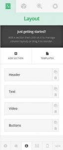 The Layout Tab allows you to Add a blank Section or insert one from a template. Each section displayed allows you to Copy or Delete it. You may also change the order in which Sections are displayed by simply dragging a section to the desired location.
Advanced: When you click the Templates button you can optionally save your page as a Template for later use.
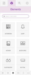 The Elements Tab displays the various elements that can be dragged and dropped onto a page. As you drag an element over a Section, Row or Column you will see the “Drop Zone” where the element will be placed.
If you haven’t already done so, click the “Edit With Cornerstone” link on the toolbar. Your page/post will temporarily disappear and the Cornerstone Logo will be rotating. In a few seconds your page/post will reappear and you will see the toolbox in the left hand panel as pictured to the left.
Each item on your page/post has an associated properties editor that will be displayed in the Inspector Tab. Simply click on an element on the page and the proper properties editor will be automatically loaded. For example, click on a block of text and the text properties editor is displayed. Click on an image and the image properties editor is displayed. Properties Editors are based on the type of the element.
The edits you will generally use are listed below.
Edit Elements
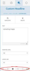
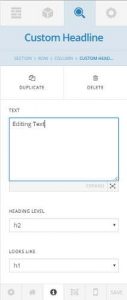 There are two styles of Headlines available. Custom Headline and Featured Headline. The only practical difference between the two is that the Featured Headline displays an icon alongside the headline. If you click a headline on the page, the Headline Properties (settings) editor will be displayed in the Inspector Tab.
Tip: Generally you will edit the headline text, and on featured headlines,the icon properties.
The following properties (settings) are available:
- text: the text editor is a plain text editor that accepts only simple HTML tags.
- heading level: Used internally
- looks like: Sets the actual text style displayed
- text color: Sets the color of the text displayed
- icon: Sets the icon to display by the headline. Note: Only works with “Featured Headline”.
- icon color: Sets the color of the icon,
- back color: Sets the background color of the icon.
- text align: How to align the headline text .
See Also: Editing Properties
Advanced
- id: The id of the icon. Generally only set when a link to this specific element is required.
- class: The element’s CSS class.
- style: The element’s CSS style.
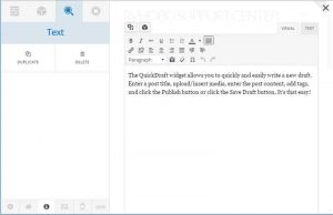
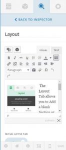
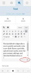 Text can be edited directly from the Inspector’s Text Editor (shown on the left) or you can use the Expanded Editor (shown below/right) by clicking the “expand” button located in the lower right hand corner of the Inspector’s Text Editor (left image).
Both of the editing options offer two views, each located in its own Tab entitled; Visual and Text. Unless you are familiar with HTML, we highly recommend the Visual Editor.
The Visual Editor works like most word processors and high-end email systems. You will notice familiar buttons on the toolbar at the top. If your toolbar is a single row, click the “Toolbar Toggle” button located on the right hand side of the first row of the toolbar to display all of the buttons.
You will also see two small images on the top/left side of the Visual Editors. These allow you to insert images and “shortcuts”.
Additional Settings
- Duplicate | Delete: When the text editor is not inside a Container, you can duplicate it and all of its settings by pressing the “Duplicate” button. The Element can be deleted by clicking the “Delete” button. You will be asked for confirmation.
- Text Align: You can set how the text will be aligned by pressing the word-processor style text align buttons.
Advanced Settings
- Id: You can set an Id for the element. Generally only used when a jump table accesses the element.
- Class: The CSS class to apply to the element
- Style: The CSS style to apply to the element
More On Using The Visual Editor…
- Video Tutorial: http://support.rvhobo.net/wordpress/editing-text
- Documentation: http://easywpguide.com/wordpress-manual/adding-your-site-content/adding-content-with-the-visual-editor/
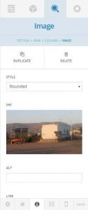 The images properties editor will be loaded and available when you click on an image.
Tip: Generally you will only use the image src property to change the image. You may also want to change the image into a button by setting its link property.
The following properties (settings) are available for inspection and/or setting.
- style: How the image should be displayed; None, Thumbnail, Rounded, Circle.
- src: If the image is set, it displays the image. if it is clicked when set, the image will be deleted. When no image is set, click the “+” sign to add a new image using the Media Library.
- link: ON/OFF – Turns the image into a link with URL. Displays “Hand” cursor and highlights it when the mouse is over it.
- href: Is only displayed if the link is set to ON. Enter the URL to go to when the image is clicked.
- link title attribute: The text to display when the mouse is over the image.
- open link in new window: ON/OFF – By default, when the image is clicked, the current page will be replaced with the page from the link’s URL. If set to ON, the new page will be opened in a new tab in the browser or in a new window depending on the user’s browser settings.
- info: Determines how to show the link title attribute when the mouse is over the image; Options: none, popover, tooltip.
Note: Additional image properties can be set from the Media Library.
See Also: Editing Properties
Advanced
- id: Generally used if the element is to receive focus when a link “jumps” to it.
- class: The CSS class to apply to the image element.
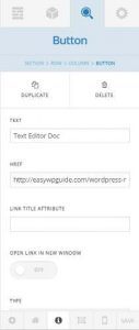 The button properties editor will be loaded and available when you click on an button.
Tip: You will mainly want to edit the button’s text and link. In some cases, you also want to add or change an image on the button.
The following properties (settings) are available for inspection and/or setting:
- text: text that appears on the button.
- href: when the button is clicked, this is where the link goes.
- link title attribute: the info text about the link that appears when you hover your mouse over the button
- open link in new window: On/Off. If On, when you click the button the link will open in a new window or new tab, depending on the user’s browser settings. If Off, link will open in the current window or tab.
- type:
- Global: button style based on the options you have selected in the Customizer.
- Real: 3D effect.
- Flat: no 3D effect.
- Transparent: no 3D effect with border and text color only.
- shape:
- Square: square corners.
- Rounded: rounded corners.
- Pill: oblong shaped.
- size: Mini, small, regular, large, X-large, Jumbo.
- block: On/Off. If On, will use the entire width of the page for the button. If Off, the width will be dependent on the amount of text on the button, unless that width is customized with CSS.
- marketing circle: On/Off. If On, adds a pre-defined image around the button to highlight it. If Off, no image around the button.
- enable icon: On/Off. If On, you may select a pre-made icon from the list below. If Off, no icon is visible.
- icon placement:
- Icon Only: no button text visible.
- Before: icon is placed before button text.
- After: icon is placed after the button text.
- icon: list of available icons. Scroll through the list, use the expand button to see more icons at one time or use the search box if you know the name of the icon.
- info:
- None: nothing happens when you hover your mouse over the button.
- tooltip: select this if you want a tooltip to appear when you hover your mouse over the button. When you select this, properties for the tooltip appear, such as tooltip text and placement.
- popover: select this if you want a popup to appear when you hover your mouse over the button. When you select this, properties for the popup appear, such as popup text and placement.
Advanced
- id: You can set an Id for the element. Generally only used when a jump table accesses the element.
- class: The CSS class to apply to the element.
- style: The CSS style to apply to the element
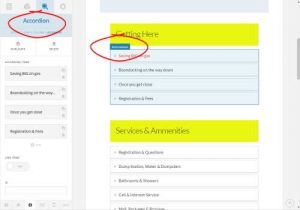 The Accordion is a compartmentalized container that displays a list of block items with
  headlines. When an item is clicked, it opens up to display formatted text similar to a blog post.
Inside the Designer, when clicked, a list of block items with corresponding headlines will appear in the Inspector as shown left.
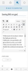
When a block item is clicked, the block items are replaced by the item editor as shown right.
The properties that are most often edited are the Title displayed in the Accordions List, and the text to be displayed when the Accordion Item is clicked.
See Edit Text
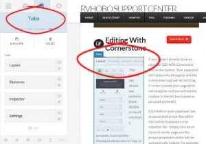 Tabs are a compartmentalized container that display a horizontal list of block items with
  headlines. When an item is clicked, it opens up to display formatted text similar to a blog post.
Inside the Designer, when clicked, a list of block items with corresponding headlines will appear in the Inspector as shown left.
When a block item is clicked, the block items are replaced by the item editor as shown right.
The properties that are most often edited are the Title displayed in the Tabs List, and the text to be displayed when the Tab is clicked.
See Edit Text
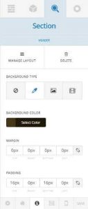
 The easiest way to find and edit a Section is by clicking the Layout Tab as shown left, and clicking a Section Block. This will highlight the section in the Designer. Sections can also be found by clicking the outer edges of a Section.
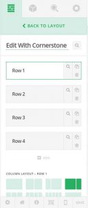 You can change the order of the Sections by dragging them to the desired location right in the editor. When you click a Section Block in the editor, it will display a list of its contained Rows as seen right. Rows, like sections can be reordered by dragging them to the desired location within the editor.
Click on a Row to bring up its editor.
Please note you can add a new Blank Section by clicking “Add Section” from the Layout Tab, or a Section Template by clicking Templates. “Templates” will create a populated Section.
 There are two ways to find and edit a row. The easiest way is to go to the Layout Tab and click a Section Block as shown left. This will bring up the Rows Editor as shown right.
  You can also click around the outer edges of elements displayed on the page in the Designer. This will bring up the associated Row Editor.
If you have brought up the Rows Editor from a Section, you have two editing choices. Each Row can contain Columns. Below the list of Rows is the Column Layout Editor. You have to click a row before setting or viewing its column layout.
To the right of each Row are three icons or buttons. To set the Row Properties, click the Magnifying Glass. To copy the Row, click the Copy Button, to delete a Row, click the Trash Can.
Editing a Row: When you click the Magnifying Glass th eRow Editor will be brought up. Here you can change many common properties, and a couple of not so common properties.
- Column Container ON/OFF – Allows Columns to be full width rather than padded.
- Marginless Columns: ON/OFF – Removes the Themes default margin from Columns.
To get help with editing standard properties, see Editing Properties.
You can reorder Rows by simply dragging them to the desired destination.
Editing Properties & a li’l HTML
How to edit most properties will be evident when you see them. However, some properties will have their own editors, some just require a little insight into what may not be obvious at first glance. Here are a few Tips & Tricks.

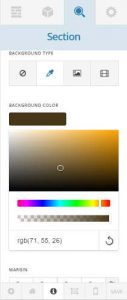 If you click a Select Color property button, the color dialog will be opened.The middle bar will get you to a color which will be displayed in the main color box. Drag the small circle in that box to the desired color, or as close to it as possible. The lower bar will let you fine tune the color.
You can also input a color notation below the lower bar, for example the following would be valid:
- hexadecimal color notation: #ff0000
- color name: red
- red, green, blue: rgb(255, 0, 0)
- red, green, blue, alpha channel (opacity): rgba (255, 0, 0, 1)
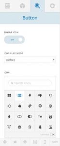 Icons differ from Images. Icons are used to add to identifying what an Element does. Some elements such as Buttons require that you turn the Icon Property ON before you can set it. Others such as Featured Headlines have an Icon preset.
To set an Icon for an Element, if required, set the Icon Property to ON. Scroll down to the Icon Editor which will often, but not always allow you to set the Icon position (right/left) . There will be an Icon edit control that will let you search for Icons followed by a list of Icons. As there are over a hundred Icons, you may want to click the Icon Expand Button and see a full page of Icons.
To select an Icon, simply click it and in a second or two you will see the Icon displayed in the Element.
You can also set the Icon’s Color and Background Color.
- Margins are the spacing outside the box. The spacing between Elements. For example, the spacing between Rows or Sections.
- Padding is the spacing Inside the box. For example a Column would display a Text Element within the Column with spacing around the inside Text Element set to the Padding lengths.
- Id is how you find an Element when you need to “Jump” to it or call it using DOM.
- Class is any standard and declared CSS Class.
- Style is any standard CSS Style declaration. Do not enclose them within the style attribute and quotes.
- Bold <b>Your Text</b>
- Italics <i>Your Text</i>
- Color <span style=”color: red”>Your Text</span>
- Link <a href=”http://www.mywebsite.com”>My Website</a>
